Product & Experience · Built around the people who use it

Many customers don’t complain. They just leave.

Product and experience engineering means building what you offer around the people who use it: following their whole visit, fixing what trips them up, and making it work for people of every ability.

Where did the orange fall?

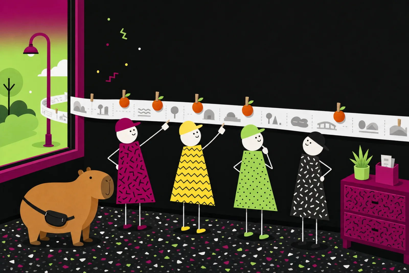
Pick a guest and follow their day along the paper timeline. Their orange is pegged where they gave up, and it stays there.

A paper timeline of a guest’s day, with an orange pegged at each place a guest gave up

  1. Car park: Everyone arrives with their orange on. So far, so good.
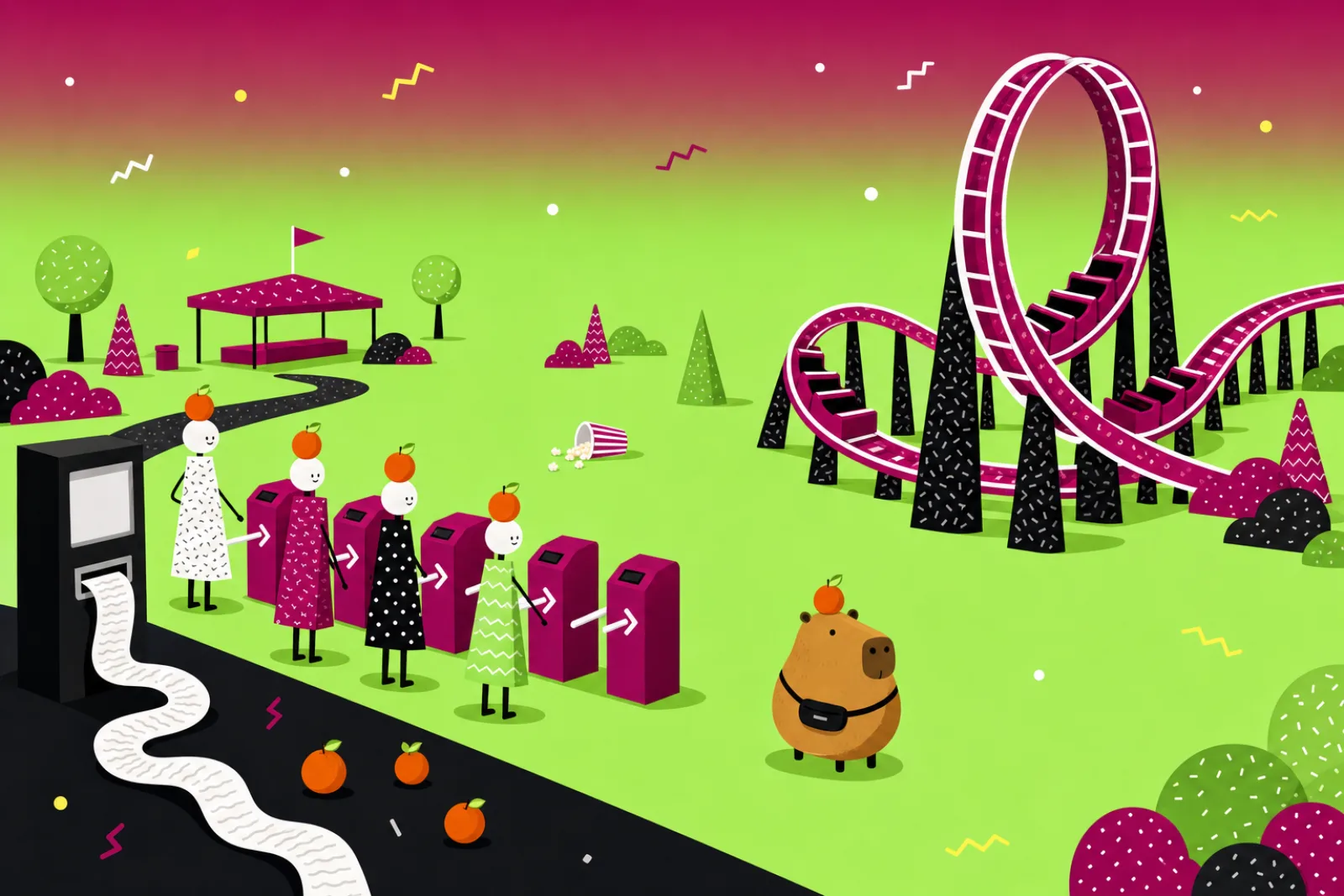
  2. Gate: Grandpa. Four turnstiles, each pointing at the next.
  3. Tickets: Capi. Tiny print on the ticket machine. She gives up.
  4. Queue: Bia. Three tall steps up to the queue, and she uses a wheelchair.
  5. The Looper: The ride is great. The trouble is getting here.
  6. Snacks: A girl on an old phone. The snack stand’s pay screen spins and spins on her old phone.
  7. Help: A parent with a pram. The help desk is hidden behind the ride.
  8. Exit: A guest who reaches the exit with their orange on may well come back.
Whose day do you want to follow?

TicketsCapi

In the park
Tiny print on the ticket machine. She gives up.
On your app or website
A sign-up form full of small print and legal words.
Backstage
The wording was copied from a contract, and nobody looks after the screen.
What we’d try
Plain words and big text, with the small print one tap away.
Who looks after this stop
Tickets crew
What this means

In our short film, the park is your app, website or service, the guests are your customers, the best ride is the feature you’re proud of, and an orange falling off a guest’s head is a customer quietly giving up. The paper timeline is the customer’s whole visit, step by step, and backstage is the people, systems and suppliers behind each step.

  • Car park: Everyone arrives with their orange on. So far, so good.
  • The Looper: The ride is great. The trouble is getting here.
  • Exit: A guest who reaches the exit with their orange on may well come back.

Worth knowing: A timeline like this comes from watching and talking with real customers, not from guessing at a desk.

Experts call this: customer journey map, service design

Watch · 2 min 7 sec

Product & Experience, explained

Rafael’s theme park has one great ride and nobody on it. Capi the capybara shows why: every guest has an orange on their head, and it falls off when they give up. A short, funny film about designing the whole visit, not just the ride.

Read the story instead
  1. NarratorRafael’s park has one great ride... and one very lonely popcorn.
  2. NarratorThis is Capi. Every guest here has an orange on their head. Give up, and it falls off.
  3. CapiIt’s a gate, not a riddle!
  4. NarratorThen a ticket machine in tiny print. Capi gives up.
  5. NarratorYour app or website is a park like this. Many people don’t complain. They just leave.
  6. NarratorGuests spend a whole day, not one ride. So design the whole visit: product and experience engineering.
  7. NarratorSo Rafael follows real guests, watching every orange.
  8. RafaelMy gate scared them off?!
  9. NarratorRafael pins each fallen orange on one timeline of the guest’s whole day.
  10. NarratorEvery team follows the same timeline, so no guest falls between them.
  11. NarratorFirst fix: a ramp. Bia, in her wheelchair, rolls up first, then prams... and one lazy capybara.
  12. NarratorNext, a test. Half the guests meet Rafael’s singing mascot. The others get a plain arrow.
  13. NarratorTwo to one! Rafael declares victory.
  14. CapiBoth of those were me.
  15. NarratorCount lots of guests. Keep whichever gets more people in.
  16. NarratorCounting shows which won, not why. So Rafael asks.
  17. CapiTiny print scared me. Also... hot tub, please?
  18. CapiA hot tub! Still can’t buy a ticket.
  19. NarratorShe asked for a hot tub. She needed a ticket.
  20. NarratorThis time, Rafael builds small fixes, even for old phones, and tries each with real guests.
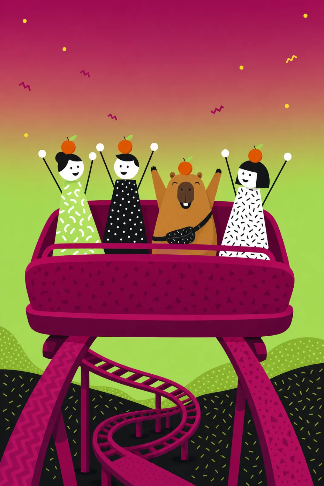
  21. NarratorWeeks later, Capi walks the whole day again, right onto the best ride.
  22. CapiOrange still on!
  23. NarratorAlgoshred helps your team talk with real customers. Then we build and test small fixes, including for those who struggle most.
  24. NarratorVisit algoshred.com, or write to contact@algoshred.com.

The idea in plain words

Four ideas for a park people get all the way through

Each one in everyday words first, then the name experts use for it.

An empty loop coaster gleaming on one side of a small park, while guests are stuck at a tangle of turnstiles and a ticket machine, with fallen oranges on the path

Design the whole visit, not just the ride.

  1. 01

    Follow the guest’s whole day

    Customers meet every step, not just your best feature: finding you, signing in, paying, waiting, asking for help. Pin each place people give up on one timeline that every team works from, so customers are less likely to fall between teams.

    Experts call this: customer journey map, service design

    Worth knowing: A timeline like this comes from watching and talking with real customers, not from guessing at a desk.

    See where each guest gave up
  2. 02

    Build the ramp first

    Design for the person who struggles most and it gets easier for many others too: the ramp built for a wheelchair is used by prams, suitcases and tired feet. On screens: bigger text, read-aloud, keyboard use and clear contrast.

    Experts call this: accessibility, inclusive design

    Worth knowing: Guidelines help, but the real test is people using it, including disabled people. We check both, and keep checking as things change. Accessibility work supports your legal obligations, but it is not legal advice or a certificate.

    See who else each fix helps
  3. 03

    Count it, then ask why

    Show two versions to real customers, each person seeing one. Once enough people have seen each version, keep the one that more people got through. Then ask why.

    Experts call this: A/B testing, user research

    Worth knowing: A test shows which version more people got through, not why. With too few people it can point the wrong way, so we wait for enough of them, and we also ask. What people ask for is a clue to what they need, not a list to build word for word.

    See why a handful of guests is not enough
  4. 04

    Small fixes, built properly

    Fix one thing at a time, build it so it works on ordinary and older phones, try it with real customers, and keep what helps.

    Experts call this: product engineering, continuous discovery

    Worth knowing: Small fixes add up only if someone keeps watching, so we help your team build that habit.

Every ability

One fix, many guests

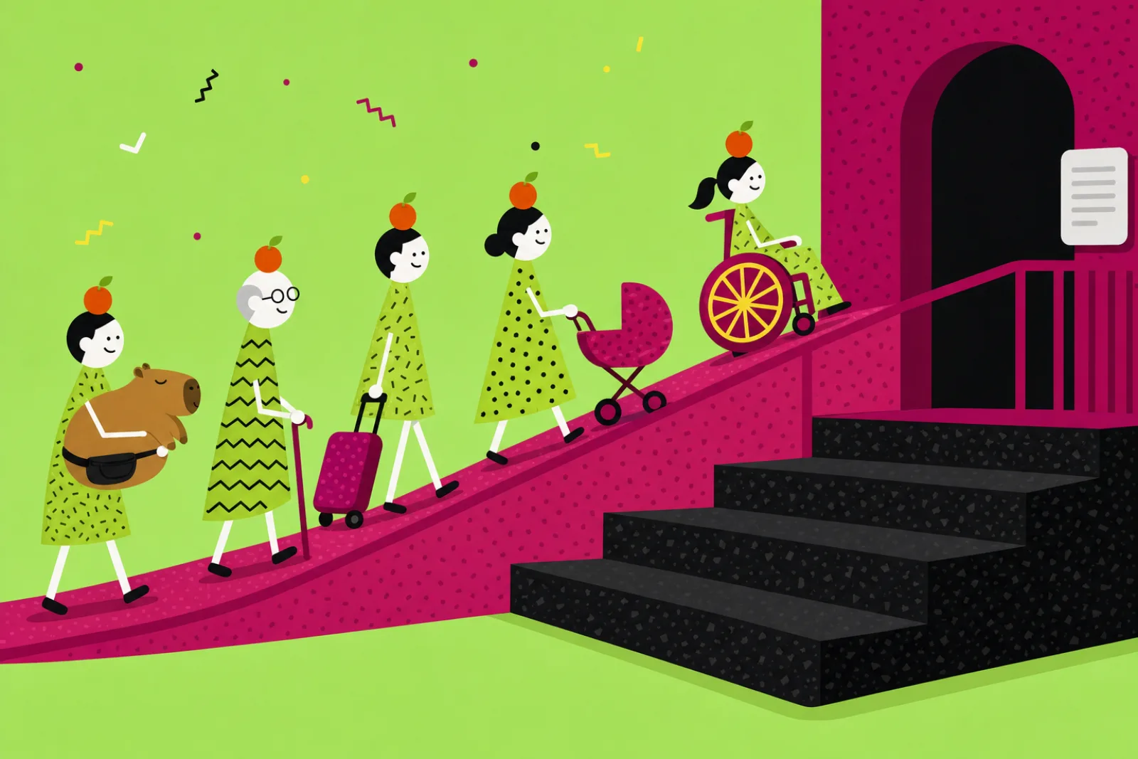
Three tall steps stand in front of the queue. Each fix is built for one guest first. Switch one on and watch who else it helps, then see what the same fix looks like on a screen.

A girl in a wheelchair rolls up a new ramp beside tall steps, followed by a pram, a suitcase, a grandpa and a lazy capybara

One lazy capybara, also using the ramp.

Who these fixes help: Bia in her wheelchair, a parent with a pram, a tourist with a suitcase on a weak signal, Grandpa, a man with his arm in a sling and Capi.

Ramp

In the park

A ramp beside the steps

On your screen

Every button works with a keyboard or one hand

Built first for: Bia in her wheelchair. Also helps: a parent with a pram, a tourist with a suitcase on a weak signal, Grandpa, a man with his arm in a sling and Capi.

Experts call this: accessibility

Big, clear signs

In the park

Big signs with strong contrast

On your screen

Bigger text, clear contrast, plain words

Built first for: Grandpa. Also helps: a boy squinting at a phone in bright sun and Capi.

Experts call this: inclusive design, content design

Read-aloud

In the park

A sign that speaks when you press it

On your screen

Screens that work properly with screen readers

Built first for: a woman who is blind and uses a white cane. Also helps: Grandpa and a boy squinting at a phone in bright sun.

Experts call this: screen readers, assistive technology

Works on old phones

In the park

A pay screen that doesn’t spin

On your screen

Steady on older phones and weak signals

Built first for: a girl on an old phone. Also helps: a tourist with a suitcase on a weak signal.

Experts call this: performance

Worth knowing: Guidelines help, but the real test is people using it, including disabled people. We check both, and keep checking as things change.

Worth knowing: Accessibility work supports your legal obligations, but it is not legal advice or a certificate.

Fair tests

The coin at the fork

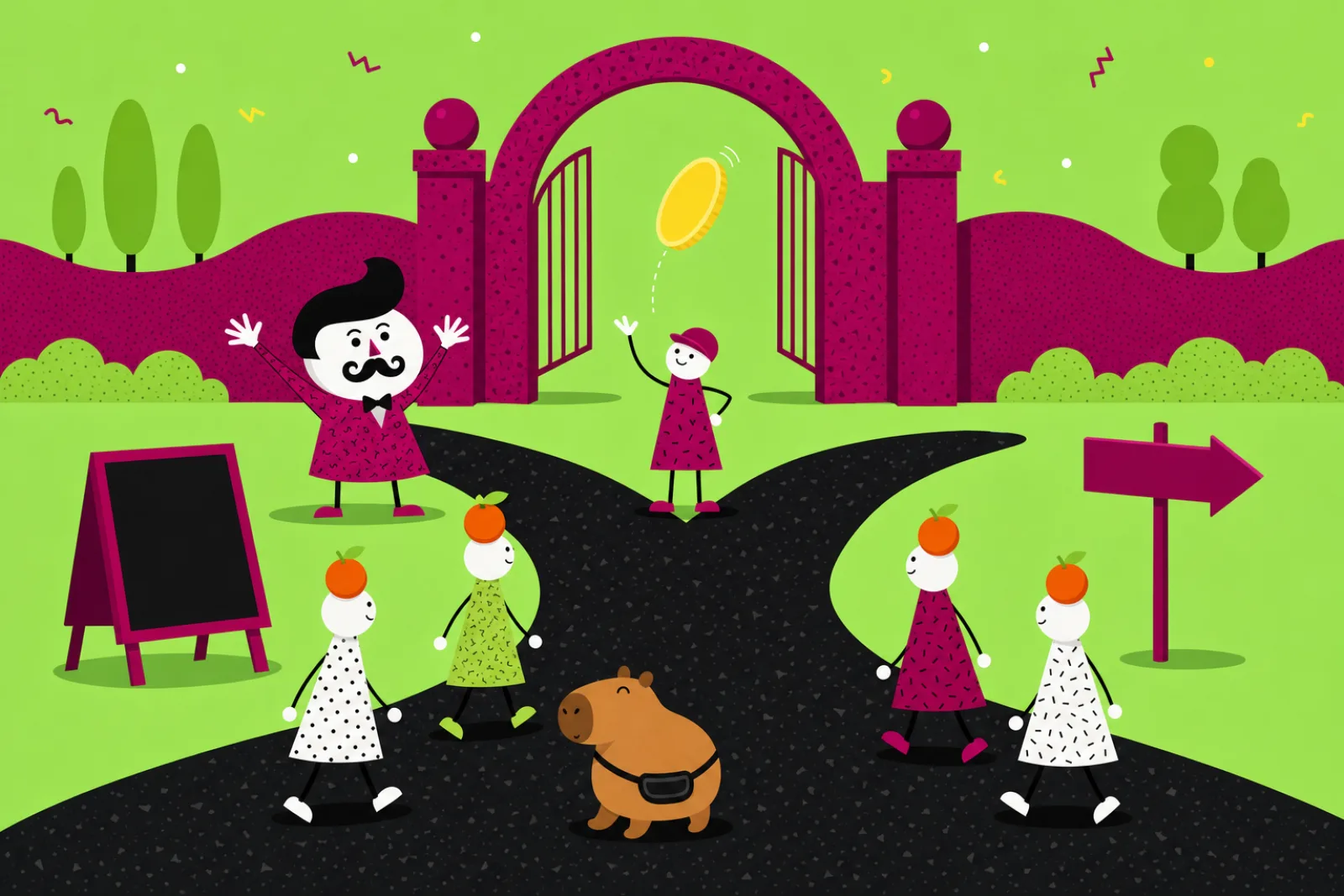
At the fork a coin sends each guest one way: to Rafael’s singing mascot, or to a plain arrow. Add more guests and watch the board.

A park path splitting in two at a coin flip, with a singing mascot down one side and a plain arrow sign down the other
How many guests have been through?
Singing mascotPlain arrowAn illustration, not a measurement.

Too early to tell. And two of those were the same capybara.

Then ask why

Why did you give up?

Tiny print scared me.

Also… hot tub, please?

What she asked forShe asked for a hot tub.
BeforeThe bearer hereinafter agrees…
AfterTap to pay. Done.
What she neededShe needed a ticket.

Experts call this: A/B testing

Experts call this: user research

Worth knowing: A test shows which version more people got through, not why. With too few people it can point the wrong way, so we wait for enough of them, and we also ask.

Worth knowing: What people ask for is a clue to what they need, not a list to build word for word.

Sounds familiar?

Where the oranges are falling

If two or more of these ring true, the trouble is probably not your best feature.

  • “People love the main feature, but many give up before they reach it.”
  • “Customers phone or email to do things the app or website should let them do.”
  • “Each team looks after its own screen, and nobody looks after the whole journey.”
  • “Design choices are settled in meetings, not by watching customers.”
  • “Nobody has checked whether someone using a screen reader, a keyboard or large text can finish the job.”
  • “It works well on the office’s new phones, and less well on your customers’ older ones.”

Where are your oranges falling?

Seven quick questions. Answer for one journey your customers take.

01Has someone on your team watched a real customer go through this journey recently?
02Is there one picture of the whole journey that every team works from?
03Can someone using only a keyboard or a screen reader finish it?
04Do the screens use your customers’ words rather than your own?
05When two designs are argued over, do you try them with customers?
06Does it work on an ordinary, older phone with a weak signal?
07Is someone still watching the journey after each change ships?

Where we would look first

Answer a question to see where we would look first.

Talk it through

Your answers stay on this page.

Nothing you choose here is stored or sent anywhere unless you email it yourself.

What we help with

From one guest’s day to a product that keeps improving

Eight pieces of work. Start with the one journey your customers find hardest, or bring them together.

Understand the guest

Every step a customer takes, seen through their eyes.

Ride along with your customers

A clear list of where people get stuck, in their own words.

With their permission, we watch and talk with real customers as they use your product, and read what your support team and your numbers already show.

Experts call this: user research, product discovery
Pin the whole visit on one timeline

One shared timeline of where people give up, and which backstage fix to try first.

Every step a customer takes across app, website, phone and shop, with the people, systems and suppliers backstage at each step.

Experts call this: customer journey map, service blueprint, service design

Also in this area

  • Customer interviews and ride-alongs
  • Usability testing in small, repeated rounds
  • Customer journey timelines
  • Service blueprints across channels and backstage
  • Reading support calls, feedback and product numbers for patterns

Design for every ability

Clear for the person who struggles most, and easier for many others.

Make it work for people of every ability

A fix list in order of what matters most, and accessibility built into how new work is made.

We review screens and steps against the published accessibility guidelines and with people who use screen readers, magnifiers, voice control or a keyboard only, then fix what we find. Guidelines help, but the real test is people using it, including disabled people. We check both, and keep checking as things change. Accessibility work supports your legal obligations, but it is not legal advice or a certificate.

Experts call this: accessibility review, WCAG, inclusive design

Clear screens and plain words

Screens and words tried with real customers before they are built.

Layouts, buttons, forms and wording that speak the customer’s language, show what is happening and make it easy to go back.

Experts call this: UX and UI design, content design

Try it before you build it all

Ideas checked with people before the big build.

Rough pretend versions tried with small groups of real people, round after round, keeping what works and dropping what doesn’t.

Experts call this: prototyping, usability testing

Also in this area

  • UX and interface design
  • Content design in plain words
  • Prototypes tried with real people
  • Accessibility reviews against the published guidelines and with people who use screen readers, magnifiers or voice control
  • Design for lasting, short-term and in-the-moment limits (a disability, a broken arm, bright sun)

Build it well

Fixes built properly, not painted over.

Shared building blocks

Screens that match from team to team.

One shared set of buttons, patterns and rules, with owners, so every team’s screens match and accessibility is built in from the start.

Experts call this: design system

Build it, then keep improving

A steady habit of small fixes, checked with real customers.

We build web and mobile products in small steps, keep them steady on ordinary phones and slow connections, add AI only where it solves a real customer problem with a clear way to reach a person, and keep watching after launch. Small fixes add up only if someone keeps watching, so we help your team build that habit.

Experts call this: product engineering, performance, continuous discovery

Also in this area

  • Web and mobile product engineering in small steps
  • Accessibility built into shared components
  • Steady on ordinary phones and slow connections
  • Design systems with owners
  • AI features only where they help, with a clear way to reach a person

Learn and keep improving

Count fairly, ask why, keep watching.

Two versions, one fair count

Design arguments settled by what customers do, then explained by asking them.

Fair tests where each customer sees one version, with switches that show a new version to a few people first, and agreement up front on what “better” means. A test shows which version more people got through, not why. With too few people it can point the wrong way, so we wait for enough of them, and we also ask.

Experts call this: A/B testing, experimentation, feature flags

Also in this area

  • Fair two-version tests and feature switches
  • Measures of whether people finished what they came to do
  • Regular accessibility re-checks and coaching for your teams

For your technical team: we work with what you already use, for example Figma, React, React Native, Flutter, Optimizely, GrowthBook, LaunchDarkly, Amplitude, axe and Lighthouse.

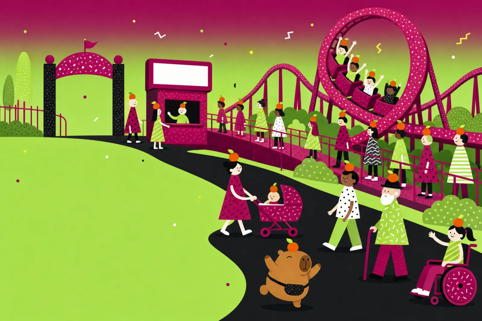
A busy, happy theme park where guests of every kind, oranges steady on their heads, walk from the gate up a ramp to a full loop coaster

Ways to start

Walk one guest’s day (follow one customer journey)

A ride-along and a timeline of one customer journey, with the places people give up marked and the backstage behind each one.

Build one ramp (an accessibility review of one journey)

An accessibility review of one key journey with people and against the published guidelines, a fix list in order, and the first fixes built. Accessibility work supports your legal obligations, but it is not legal advice or a certificate.

One fair test (two versions of one hard step)

One fair two-version test on a step customers find hard, with “better” agreed first. A test shows which version more people got through, not why, so it is followed by conversations that ask why.

Ask us to walk one journey

How we work

Follow first, then fix one stop at a time

Five steps in plain words, from the first ride-along to your team carrying on.

  1. Follow

    Follow real customers

    With their permission, we watch and talk with real customers through one journey, and read what support and your numbers already say.

  2. Pin

    Pin every fallen orange on one timeline

    We set out the whole visit and its backstage on one timeline, mark where people give up, and agree with you what “better” means before anything changes.

  3. Try

    Try fixes with people

    We try rough pretend versions of the fixes with small groups of real people, keep what works and drop what doesn’t.

  4. Build

    Build them properly

    We build the chosen fixes in small steps, accessible from the start, steady on ordinary phones, and shown to a few customers first where a fair test helps.

  5. Keep watching

    Keep watching, with your team

    We watch again, fix the next place people give up, re-check accessibility, and hand your team the timeline, building blocks and habits to carry on. We work with your teams one journey at a time. We describe how we work, not a promised result.

What you get along the way

  • A timeline of the customer’s whole visit, with the places people give up pinned on
  • Backstage notes for each stop: who and what makes it work
  • An accessibility fix list in order of what matters most (not a certificate)
  • Prototypes, and the notes from the rounds with real people
  • A fair-test plan with “better” written down first
  • Shared building blocks with owners
  • The fixes built, plus a short handover so your team can keep watching
A long paper strip of a guest’s day running round a park office and out of the window, with oranges pegged on where guests gave up and four crews gathered at it

Where it fits

Where it becomes real

Illustrative examples, not customer stories: the kind of work this approach suits.

Retail and online shops
A checkout that asks for an account before payment is tried against one that lets people pay as a guest, each shopper seeing one. The team keeps the one more people get through, then asks shoppers why, because a count shows which, not why.
Healthcare
A clinic’s appointment booking is followed from the reminder message to the front desk, and the backstage step that made patients repeat their details is fixed.
Banking and finance
An account-opening form is tried with screen-reader and keyboard-only users, rewritten in plain words and tried again with the same people.
Government and public services
An application is joined up, so the website, the phone line and the paper form ask the same questions in the same order.
Education
A course-enrolment journey is watched on students’ own phones, and the step that jumped about while loading is steadied.
Software products
A new customer’s first week is set out on one timeline, and small fixes to the first screens are tried one at a time and kept only when people get further.

Good to know

Questions we are often asked

Plain answers to what owners and tech leads ask first. Something else on your mind?

Ask us directly

What is product and experience engineering, in plain words?

Building your app, website or service around the real people who use it: following their whole visit, fixing what trips them up, making it work for people of every ability, and improving it step by step.

Isn’t this just making it look nice?

Looks matter, but this is mostly about whether people can get through. A beautiful screen that people give up on is not doing its job.

Do we have to rebuild everything?

No. We start with the one place where customers give up most often and fix that first. A big rebuild is rarely the right first step.

How do you find out what customers need?

We watch them use it, talk with them, and read what your support team and numbers already show. What people do counts as much as what they say, and what they ask for is a clue to what they need.

Is accessibility only for disabled people?

It starts there, and it helps many others too: someone in bright sun, with an arm in a sling, with older eyes or on a slow phone. Guidelines help, but the real test is people using it, including disabled people. We check both, and keep checking as things change. Accessibility work supports your legal obligations, but it is not legal advice or a certificate.

How do you decide which version is better?

Where a fair test fits, each customer sees one version, and we wait until enough people have seen each version before deciding. A test shows which version more people got through, not why. With too few people it can point the wrong way, so we wait for enough of them, and we also ask.

Can you work with our own designers and developers?

Yes. We join your teams, use the tools you already have, and leave behind the timeline, building blocks and habits so your people can carry on.

Should we add AI to our product?

Only where it solves a real customer problem. We try it with customers like anything else, and make sure there is a clear way to reach a person when it gets things wrong.

Heard it before?

Myths, answered

Myth: “Customers will tell us what they want.”

Answer: They will tell you what they want, which is a clue to what they need, not the same thing. Watch what they do too: she asked for a hot tub, she needed a ticket.

Myth: “Accessibility is a box to tick at the end.”

Answer: It is easier to build in from the start than to bolt on at the end, and the people it helps first are rarely the only ones it helps.

Myth: “A quick test settles it.”

Answer: With a handful of people a test can point the wrong way. Agree on what better means, wait for enough people, then ask why.

Myth: “A redesign fixes it for good.”

Answer: A fresh coat of paint over the same confusing gate changes little. Small fixes, checked with people and kept up over time, do more than a one-off makeover.

Myth: “Good design is about looks.”

Answer: It is mostly about whether people can finish what they came to do.

Myth: “Each team polishing its own screen adds up to a good journey.”

Answer: Customers cross every team’s patch in one visit. One shared timeline helps stop them falling between teams.